Brand identity for an innovative company specializing in the development of advanced seed coating (incrustation) formulations for the agricultural industry. The company operates at the intersection of science, technology, and agribusiness, developing proprietary compositions that enhance seed protection, performance, and efficiency at early growth stages.
The brand identity is built around the symbolism of the Sator Square — one of the oldest known palindrome symbols, representing system, cyclicality, and a self-sustaining structure.


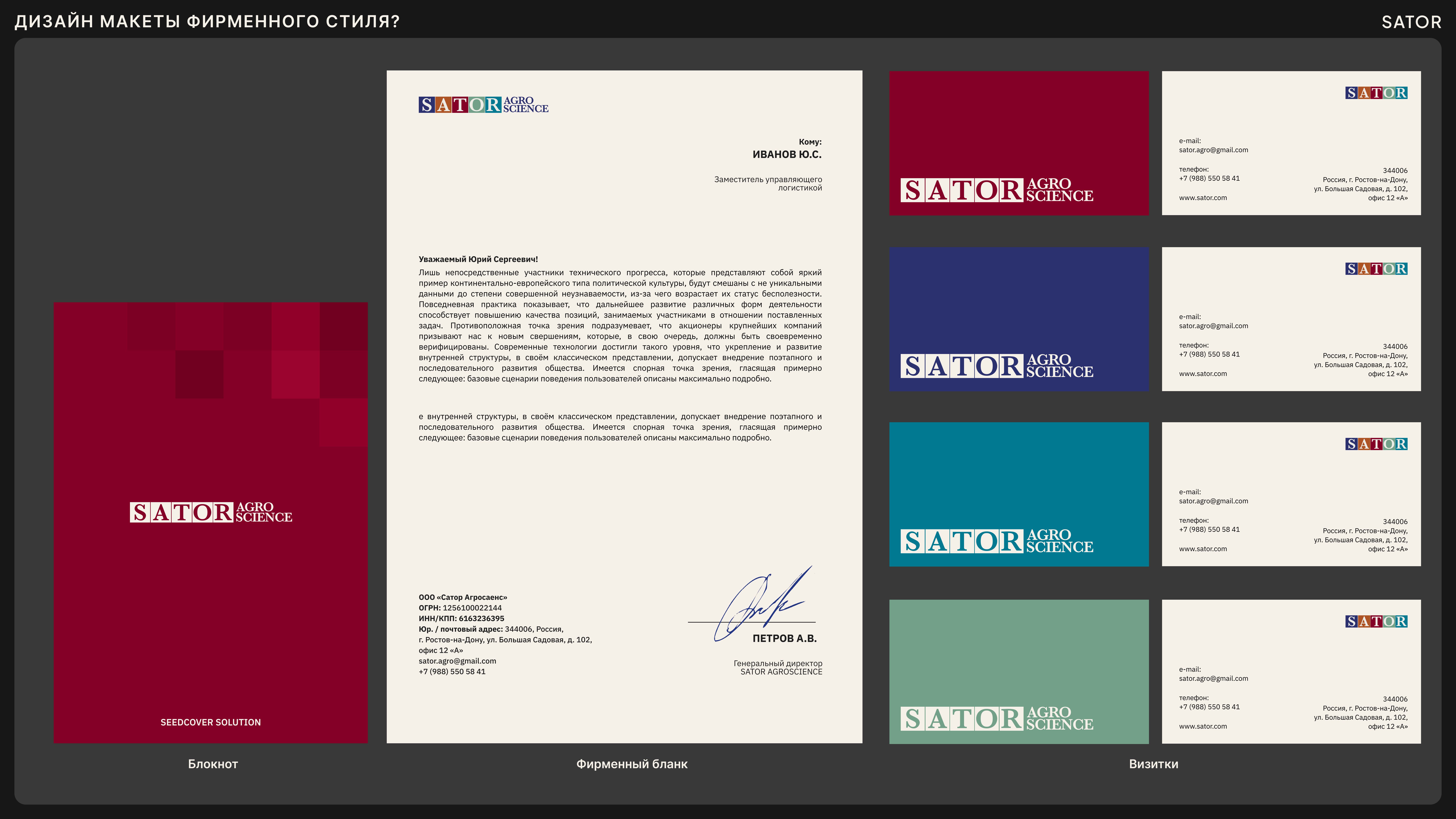

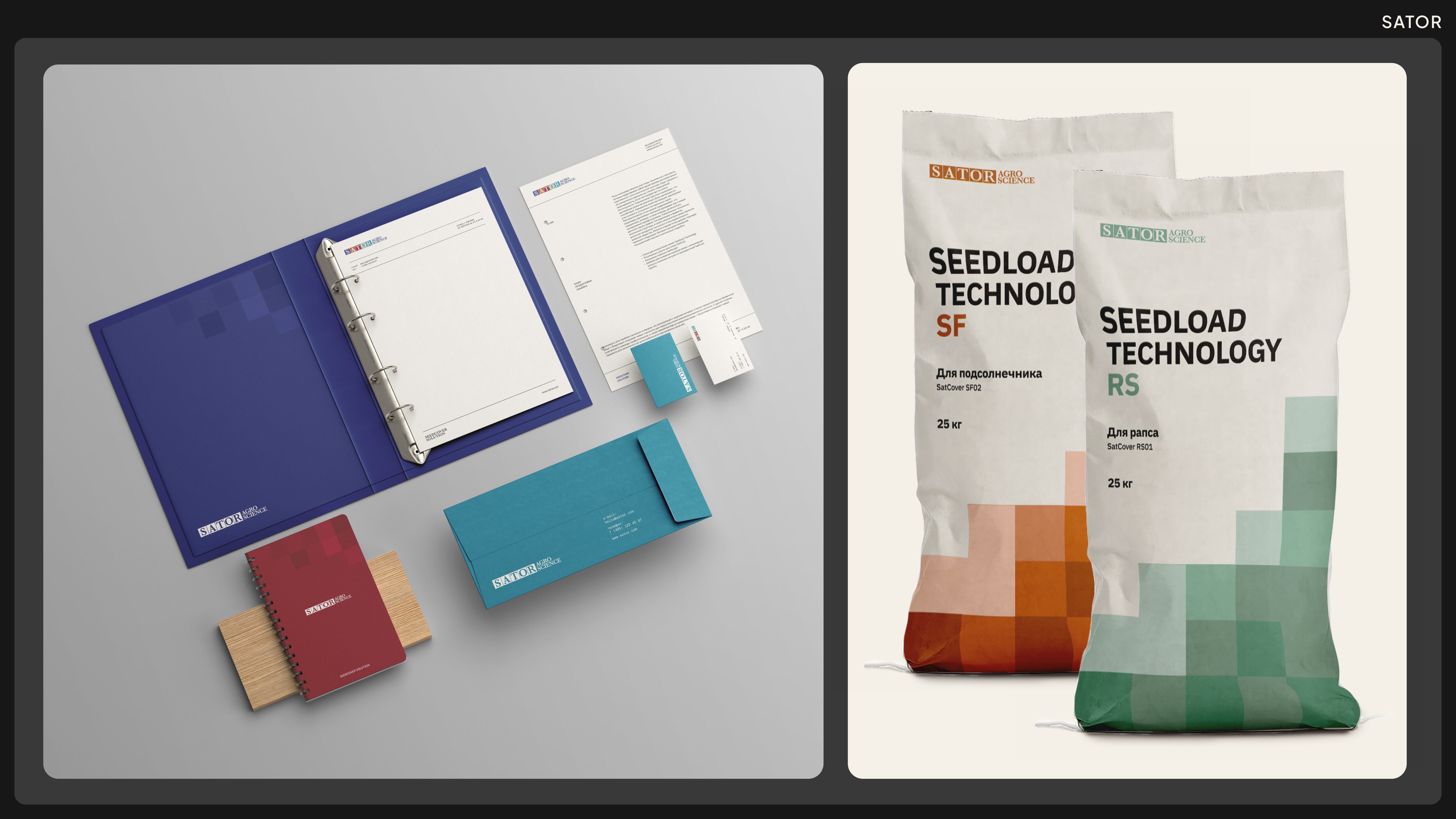

The Sator Square, which can be read identically in multiple directions, becomes a metaphor for a closed, stable process in which every element is interconnected and influences the final outcome. This idea directly reflects the company’s work: scientifically engineered formulations function as a holistic system, ensuring stability, protection, and predictable results in the agricultural industry.
The visual language is based on principles of symmetry, repetition, and strict geometry. Rhythm, modularity, and structural clarity reference scientific logic and technological precision, while emphasizing the company’s innovative nature. The identity communicates reliability, systems thinking, and depth of approach, bridging an ancient symbol of order with contemporary agrotechnology.
.jpg)