The system is built around a monochrome palette with subtle gradients that reveal a silver-like texture in typography and graphic elements. Silver conveys precision, clarity, and technological sophistication, while stone-inspired textures add a sense of grounding, solidity, and timeless strength.
The identity was designed as a scalable framework for a global event series, allowing subtle localization for different locations. Localization is achieved through small design details such as typographic accents, graphic elements, and color cues, while maintaining overall brand consistency.
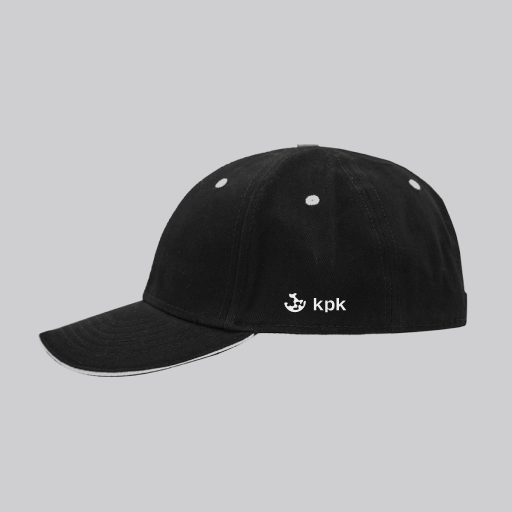
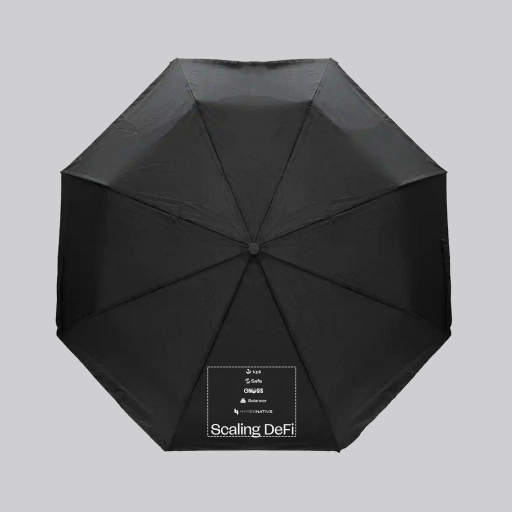

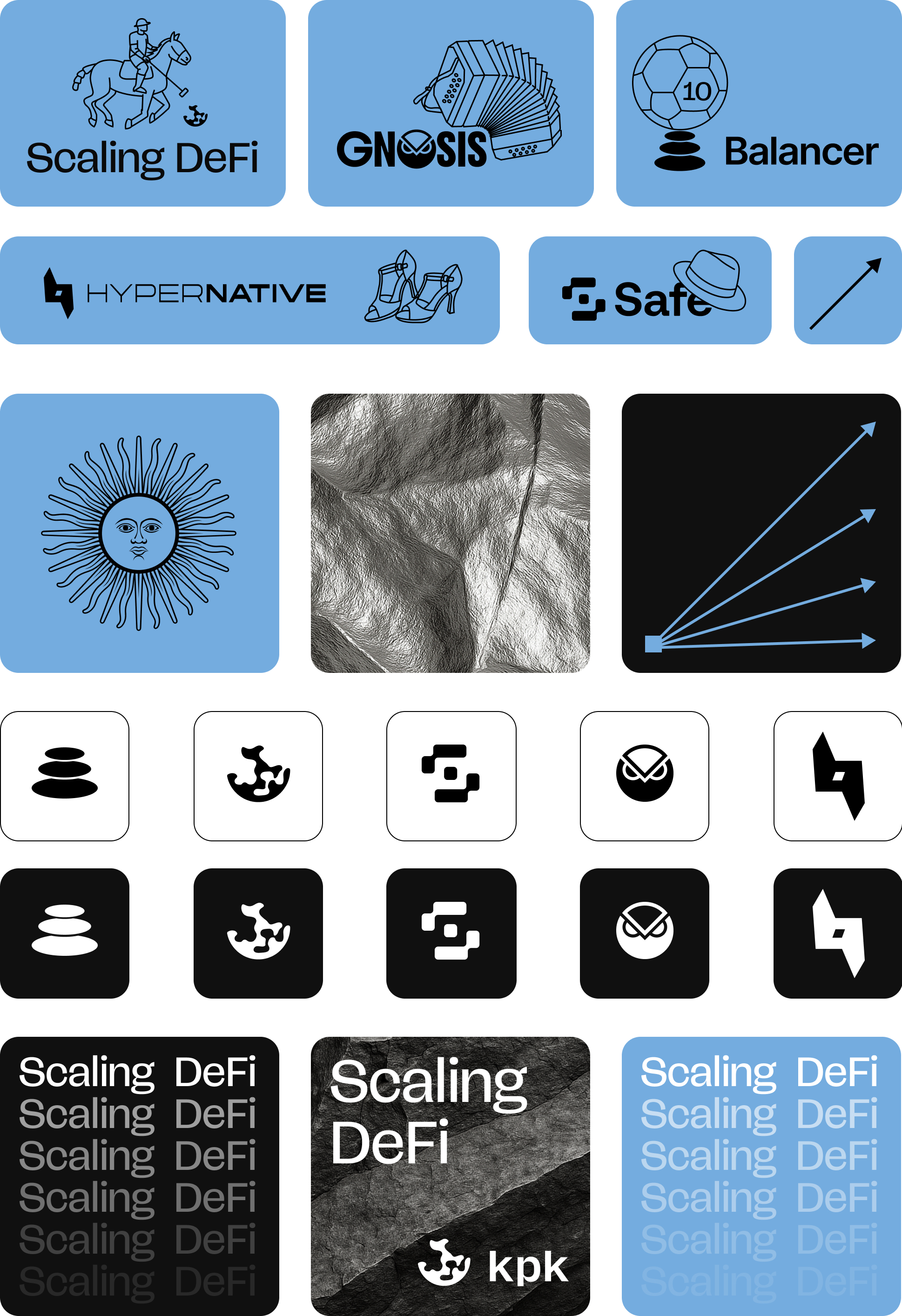
KPK is one of the leading companies managing on-chain treasuries for DAOs and Web3 protocols, including Gnosis, Safe, Aave, Balancer, ENS, dYdX, CoW Swap, Uniswap, Arbitrum, and Nexus Mutual. A dedicated visual identity was designed specifically for the kpk event series, intended to work across multiple conferences and countries while remaining consistent and recognizable.
The event identity is refined and grounded. It is minimalist and highly structured, rooted in natural materials and calm visual rhythms. The visual language communicates stability, confidence, and authenticity, reflecting kpk’s role as a reliable infrastructure layer within the Web3 ecosystem.
.jpg)
.jpg)
For the Devconnect Argentina edition, light blue accents were introduced, referencing the national flag and the clear Argentine sky. Textures were slightly adapted to reflect the local atmosphere without disrupting the core visual system.
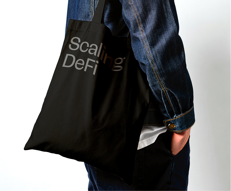
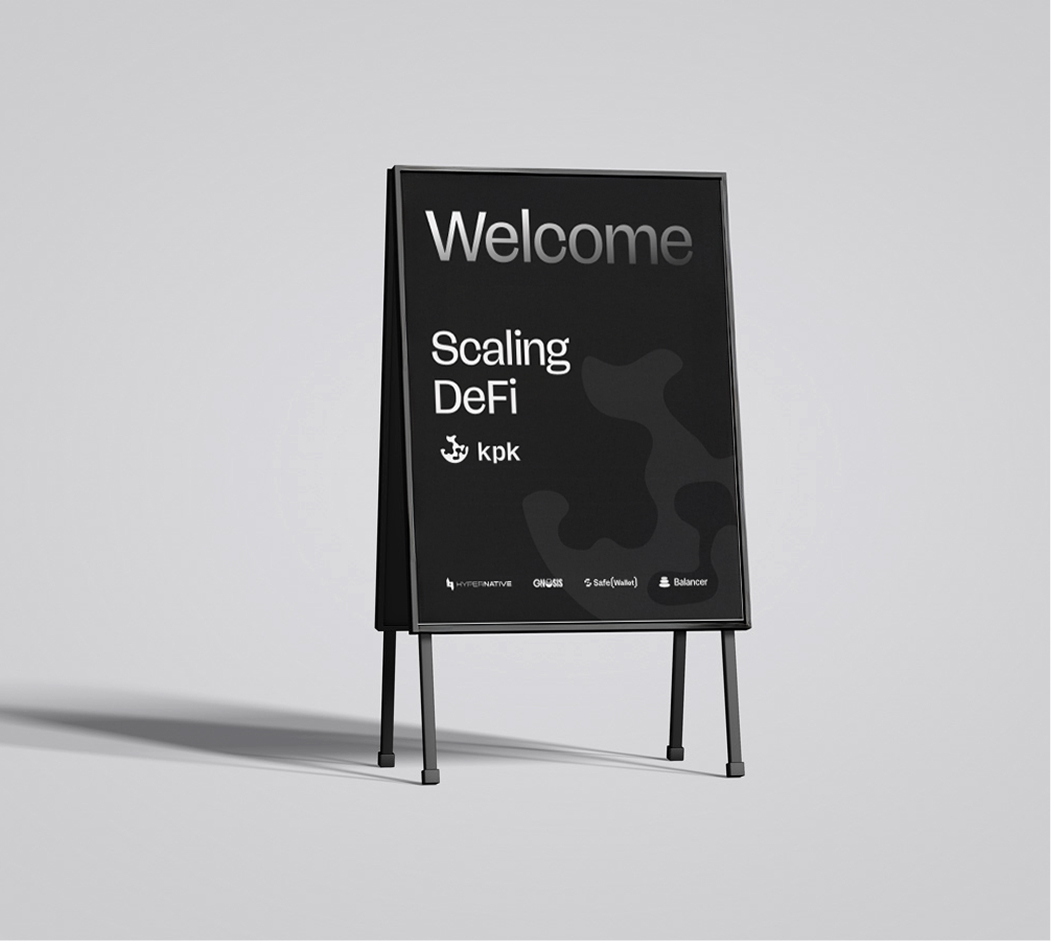
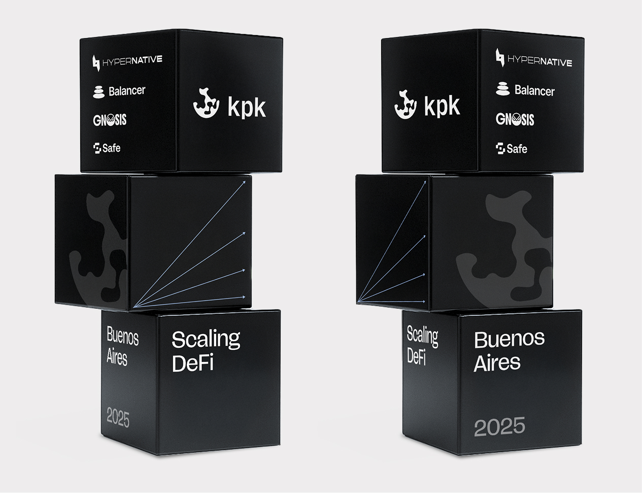
The event identity was applied across the entire event ecosystem, including merchandise, video bumpers and motion graphics, speaker screens, social media and promotional materials, as well as on-site design elements ranging from navigation to photo zones. The result is a cohesive and premium event identity that strengthens recognition across all kpk events while remaining flexible for future editions.